
IEP Direct is a leading SaaS data management solution for special education programs that is tailored to each state’s unique regulations and culture. It is the leading special education tool in New York, Connecticut, and New Jersey.
Role: UX Design / UI Design / Research / Testing / Overseeing Implementation / Running Workshops with Product Teams
“We must take the time to do research and truly understand the core problems the end-users are facing with our product, the implications of solving the wrong problem or making assumptions can be life changing! If a special ed professional misunderstands the function and makes a mistake on the IEP document, that means it might not be accepted by the state, which means the school might not provide the correct if at all proper services to a child with special needs… we bare the responsibility to make sure we solve the right problems, otherwise a child’s life will forever be impacted!”
— Yan Grinshtein (Product & Engineering feature definition meeting)
IEP Documents are inherently complicated government forms
One of the main problems we were faced with was the length, complexity and time that it was required of a special ed professional to fill out their portion of the document, the next big ticket item on our plates were the fact that this is essentially a collaboration document, this is not only one person that would be responsible for filling it up and filing it, it is a collaborative effort of many different professionals, such as Teachers, Speech Pathologists, Psychologists, and many others.

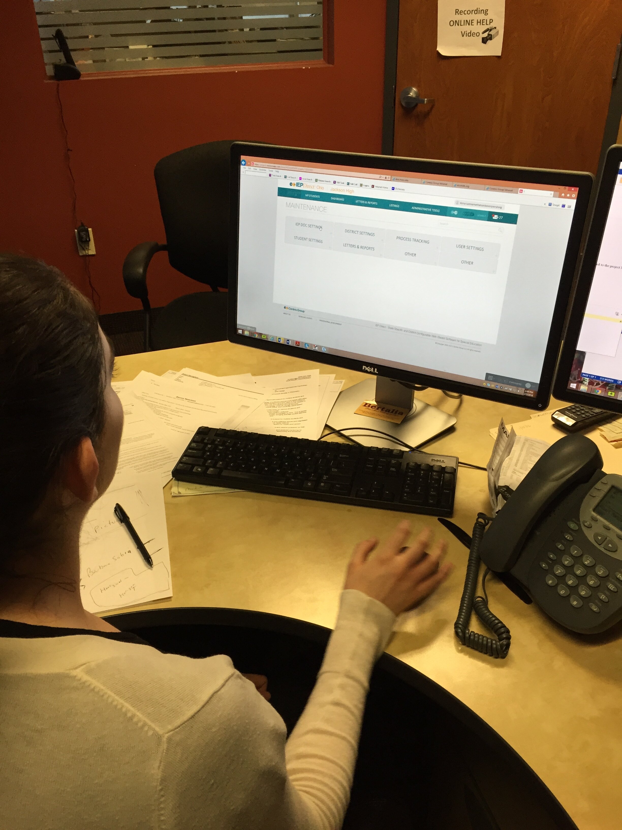
The old software
OBJECTIVE:
The ultimate goal and vision for this project was to launch a completely redesigned, and reinvented application that allows users to complete their tasks in timely manner, simpler way and with no confusions for the new state and after a year of running, testing and refining the newly redesigned application, bring it back to current states of New York, Connecticut and New Jersey.
Research & Discovery
User Research
Interviewed 15 people, woman, ages 30-65, service providers, district case managers, special ed teachers and other professionals
Stakeholders
Conducted extensive interviews with the product management team, founders and executive level managers, alongside district sales reps.
Helpdesk & Training
Spent time interviewing and casually holding discovery conversations with most members of the company’s Helpdesk staff and the Field Training teams from different states and districts
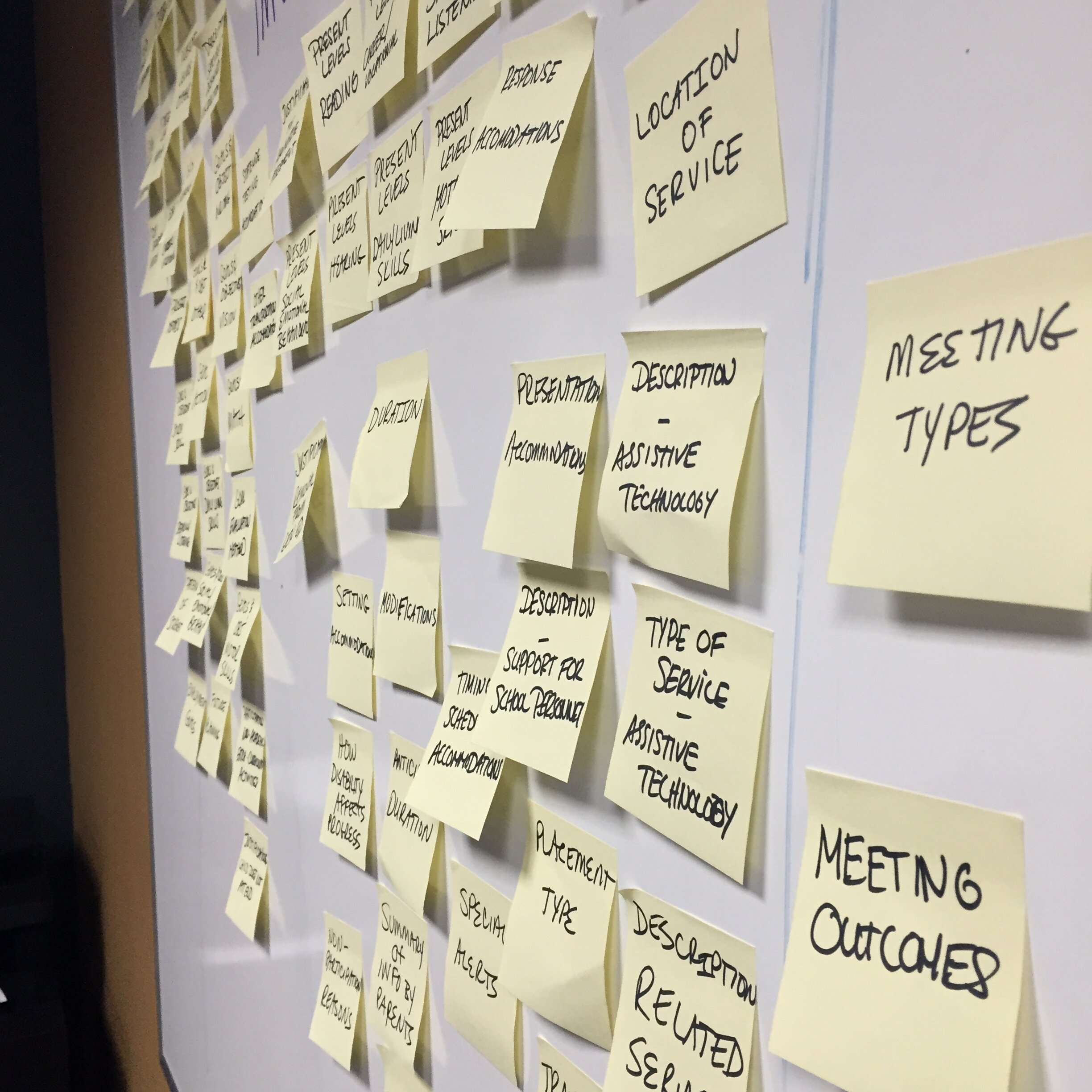
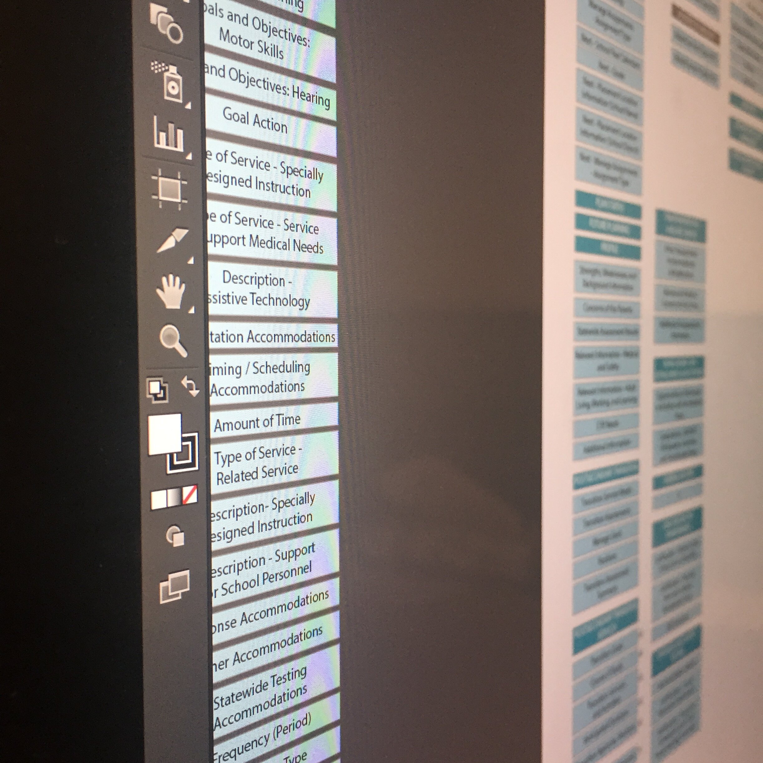
As we begun the journey of discovery and deeper understanding of what needs to be improved, changed or completely reinvented, I facilitated a card sorting exercise to better understand how the internal teams of the company see the software, by holding a multi-day card sort, first isolated for each team in the company, such as executives, sales, engineering and training, I then invited the Helpdesk team, since they have the most direct communication with the end user.


When you’re building a software for government, it is very easy to get lost in the feature race and build it based solely on the State or District requests… the problem with that, is that the actual users of the product are the teachers, and they have no say in what product they want or need to use to be successful at their jobs.
Even though technically I was blocked by the management from talking to teachers, since they are not the “customer”… as true UXer at heart and believer that it is our (designers) responsibility to make sure the end-user is able to accomplish their tasks in the most enjoyable and successful way, I anyway recruited special ed teachers in my free time on weekends to interview and run some basic tests with some of the features without exposing sensitive information.
Which proved to be a huge learning opportunity, to see how special ed professionals do their tasks, how they interact with the IEP Documents, what is the process and work flow they typically go through, their pain points, desires and real needs.
Identified User Problems
Learnability
Even after hours of training sessions, support and educational materials, users were still confused how to use the software for their respective needs. Which ultimately lead to increase of Helpdesk calls and tickets, slower user performance and lengthly document filing procedures.
Cognitive Overload
Due to overwhelming amount of information and details in each section, users are often confused what to do in the software, misunderstand what is being asked of them in each section they interact with, which leads to users confusion and mistakes in the document they are working on.
Frustration
A simple task as a data entry found to be an extremely cumbersome process in the software, it took 5 or at times more steps to go through just to be able to enter data into a specific part of the document, which lead to increased user frustration, and self-doubts in ability to properly fill out the document.
Based on our research and key findings, feedback from stakeholders and feedback from the development team, we decided to concentrate on the most painful areas of the software; IEP Document data entry and validation, Students page, and Software Maintenance Section.
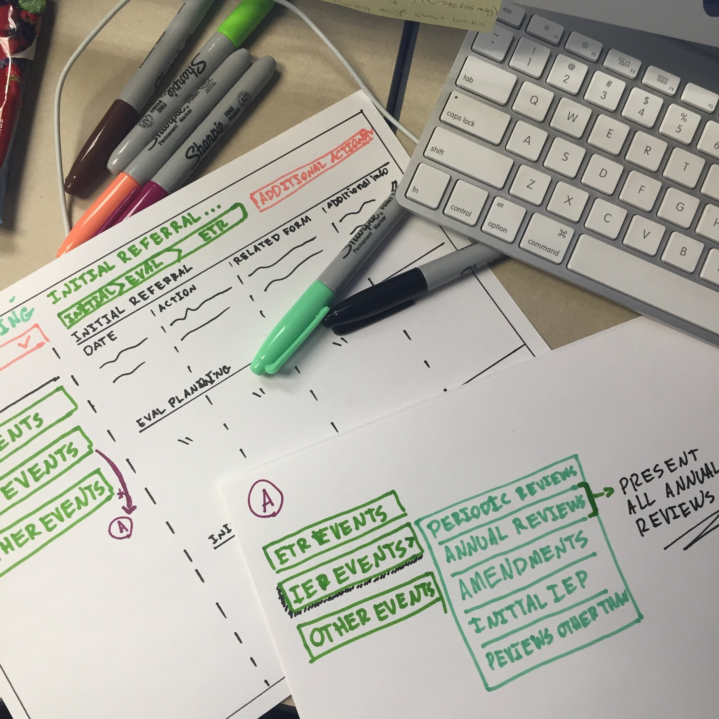

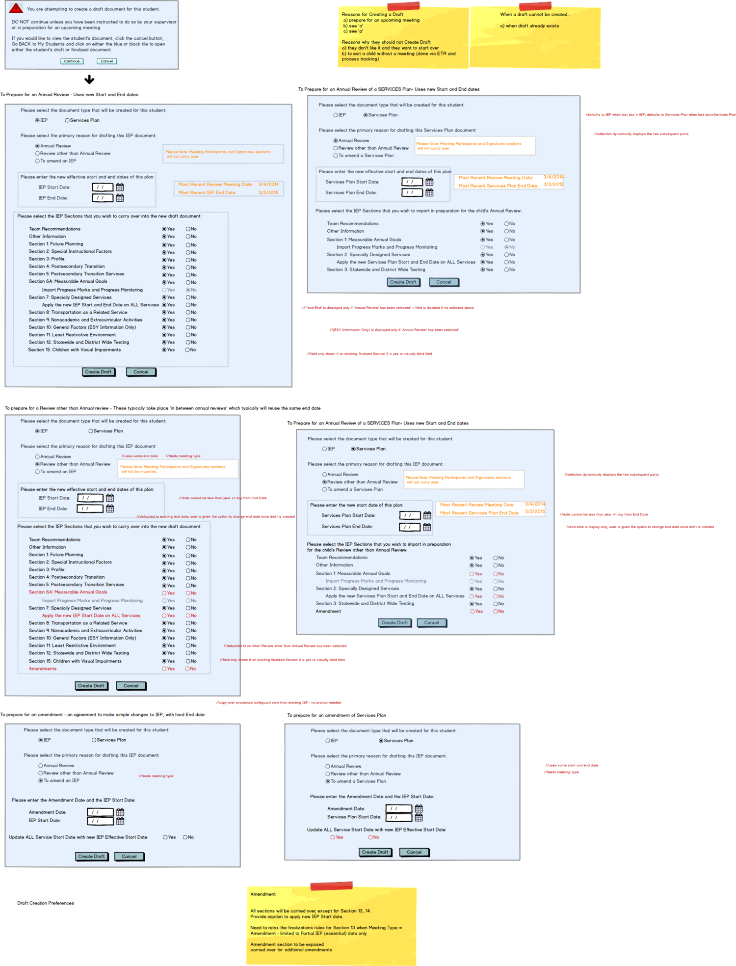


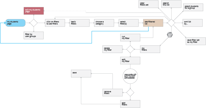


By utilizing information architecture techniques, user flows, low fidelity sketches, high fidelity screens and prototyping, we tested each of our solutions, refined and iterated numerous times and tested again.
By constant interaction with users and help desk staff we managed to validate the final designs and we have drastically improved the main areas of our focus
Improved Learnability
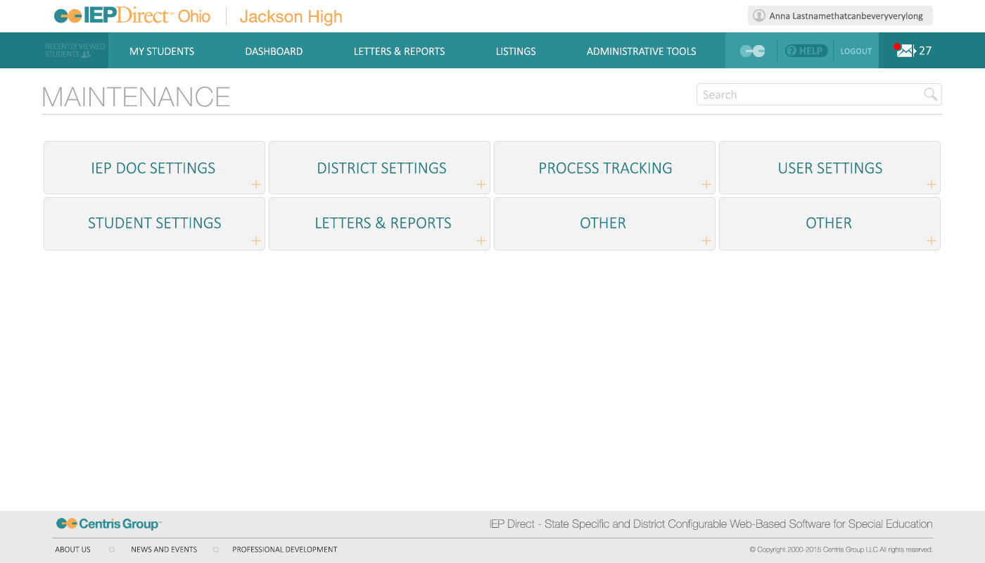
By introducing a completely new way of interacting with the document via always available pull out navigation between the document section, users were able to understand much faster how to get to where they need to go, which section is available to them, combined with the administrative side of the software, which by completely reimagining the Maintenance Section of the software, we managed to reduce Helpdesk calls by about 12.5% and improve Admin side productivity.
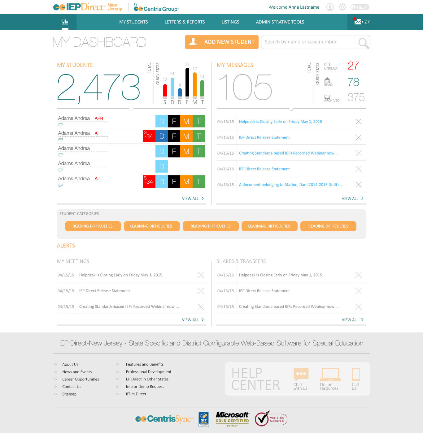
Reduced Cognitive Overload
As we redesigned many parts of the software, one of the key sections of the software was a dashboard, that for a typical school or district would likely just be a large and information heavy table that looked like a spreadsheet, by redesigning the entry way into the software into a proper dashboard with color coded identifiers for each child’s stage in the process, legend of all elements readily available and vital information large and clearly visible, we noticed a drastic improvement in information consumption and decision making based on data presented to end-user.
Reduced Frustration
By introducing an always available pull out navigation, users were able to easily jump between sections and by clicking on Edit function of the section were able to easily input data into the sections, avoiding too many steps with the improved solution, which proved to be effective and streamlined workflow of the special ed professionals, saving them time and making sure the document is executed and filed in timely manner.


“Yan is an outstanding designer with an eye for details and a true passion for proper UX interactions and design best practices. He has a great ability to not only test the validity and value of an individual implementation, but also has the thoroughness to make such empirical assertions a normal part of the operational procedures of a successful design team.”
— Robert F. QA Engineer